3 Ways to Bring Your Product Packaging to the Next Level
3 Ways to Bring Your Product Packaging to the Next Level
As the saying goes, you only get one chance to make a first impression. That’s especially true when it comes to your product packaging. Consumers will judge your product in an instant based on what they see on the outside, which means it needs to be as eye-catching, professional, and well-designed as possible. Whether you’re launching a new product or rebranding an old one, creating effective product packaging is essential for establishing brand recognition, conveying the right message about your company or product line, and giving customers something that will stand out from all of the other products on store shelves. If you’re interested in learning more about how you can bring your product packaging to the next level with these 3 ideas – keep reading!
Add Branding to Your Package
When it comes to product packaging, one of the most important things you can do is add branding. Your logo and branding is what will allow customers to identify your product amidst all of the other brands on the market. Branding will also help you to stand out from your competition, as competitors may not have the same level of branding. You’ll want to look at every element of your product packaging as an opportunity to add branding – from the colour scheme, to the fonts and typefaces you choose, to the images or photographs you include. You’ll especially want to make sure that the packaging for your product includes your logo, name, and contact information. Additionally, you may want to include a brief description of the product, or a short message describing what the product does and why someone would want to purchase it.
Try Unique Or Custom Shapes
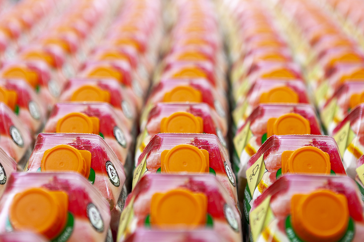
Another great way to create product packaging that truly stands out is by trying out a unique or custom shape. Depending on the product type you are packaging, you may have the ability to experiment with a variety of shapes and sizes. This could include creating something in the form of a box, a tube or container, or even a unique shape. You can also try using a 3D shape, as this will help to further stand out from the rest of the products on the shelf. You can also try creating something that is a hybrid between 2 different shapes, like a box-shaped container with a tube on top. This could include creating packaging that is a mix between a tube and a box, or a mix between a box and a cylinder. If you’re interested in trying out a unique or custom shape, make sure to do your research and take the time to find the right material that will fit your product and its needs. This will allow you to create a customized and unique shape that will help to stand out from the rest of the products on the shelf.
Leverage Synching for a Dual-Purpose Design
Another way to bring your product packaging to the next level is to create a design that has a dual-purpose. This could include creating a design that is meant to appeal to the eye, but also has functionality that helps protect the product inside. One design option that has been known to really stand out is the vacuum seal bag. These bags are designed to be airtight, which helps to protect any products inside from outside elements like moisture, light, and odours, while also preserving freshness and flavour. Another design idea that has gained popularity in recent years is creating an edible or drinkable container. This could include creating packaging that is meant to look like a drink, or a to-go container that looks like a coffee cup or a takeout container. These types of designs are unique, and offer a dual-purpose. They are not only attractive to the eye and easy to identify, but they are also functional. This makes them appealing to customers who are purchasing the product, as they know that their product is protected, remains fresh, and will not be contaminated by other odours or flavours.
Use Video and Motion to Help Appeal to All Five Senses
Another way to bring your product packaging to the next level is to appeal to more than just seeing and reading your product. In today’s world, most people are multi-sensory, meaning they are more in tune with their other senses. This includes the sense of smell, sound, taste, and feeling. Once you’ve created the actual design for your product packaging, you can use video or motion graphics to help appeal to all five senses. This could include creating a short video that includes different shots of the packaging and the product inside, or using some type of motion graphic that features your product. This will help to really bring your product to life, which will make it more appealing to potential customers. It will also help to make your product stand out from its competitors that are using just visual and text-based marketing.
Conclusion
When it comes to product packaging, it is the first thing that customers will see. You want it to stand out and appeal to them, so they’ll be interested in your product. This article discussed 3 ways to bring your product packaging to the next level. These include adding branding, trying out a unique shape, and using video and motion to appeal to all five senses.


LEAVE A COMMENT
You must be logged in to post a comment.